SP2 Cybersecurity Lab - University of Maryland
Services
Industries
Date
Overview:
The SP² Lab explores how security and privacy intersect with human behavior, aiming to better understand how people make decisions around technology and how systems can be designed to support them. This redesign enhances that mission by improving clarity, accessibility, and user engagement across the site.
Challenge:
The SP² Lab conducts groundbreaking research on security, privacy, and human behavior, but their website wasn't effectively communicating their work. When I was asked to redesign it, I expected the usual challenges—improving information architecture, enhancing visual hierarchy, making research accessible.
Research:
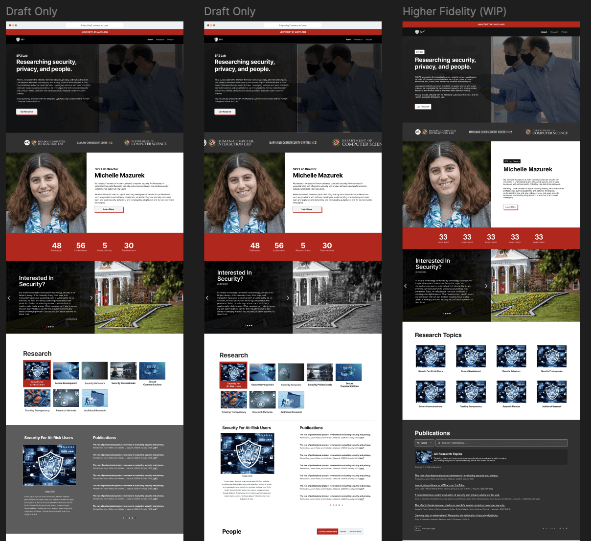
Most cybersecurity labs we analyzed—from NYU to Harvard to other UMD departments—follow a familiar playbook: bold banners showcasing university logos, impressive partnerships, and funding achievements to instantly signal credibility. These sites lean heavily into institutional prestige as their primary trust-building strategy. Our client, however, presented an intriguing challenge. They specifically requested no university branding or partnership displays, worried that visible associations could limit future funding opportunities. This constraint forced us to reimagine how a research lab establishes authority online—moving beyond traditional academic status symbols to find new ways of building trust and credibility with potential collaborators and stakeholders.
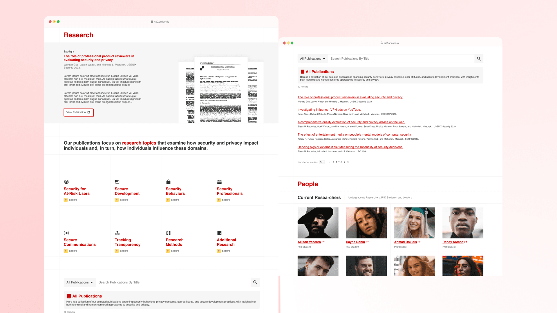
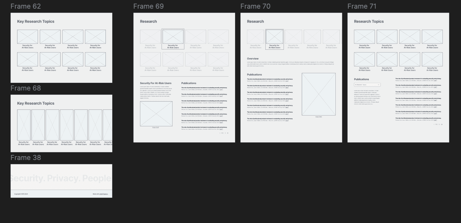
This original design below showcases the lab's research through a grid-based layout with their signature yellow typography prominently featured across gray card sections.
What I didn't expect was navigating stakeholder resistance to change.
The lab team was deeply attached to their existing design and had specific requirements:
Must be a single page (for simplicity)
Keep it very plain (personal preference)
Include yellow text (part of their desired aesthetic)
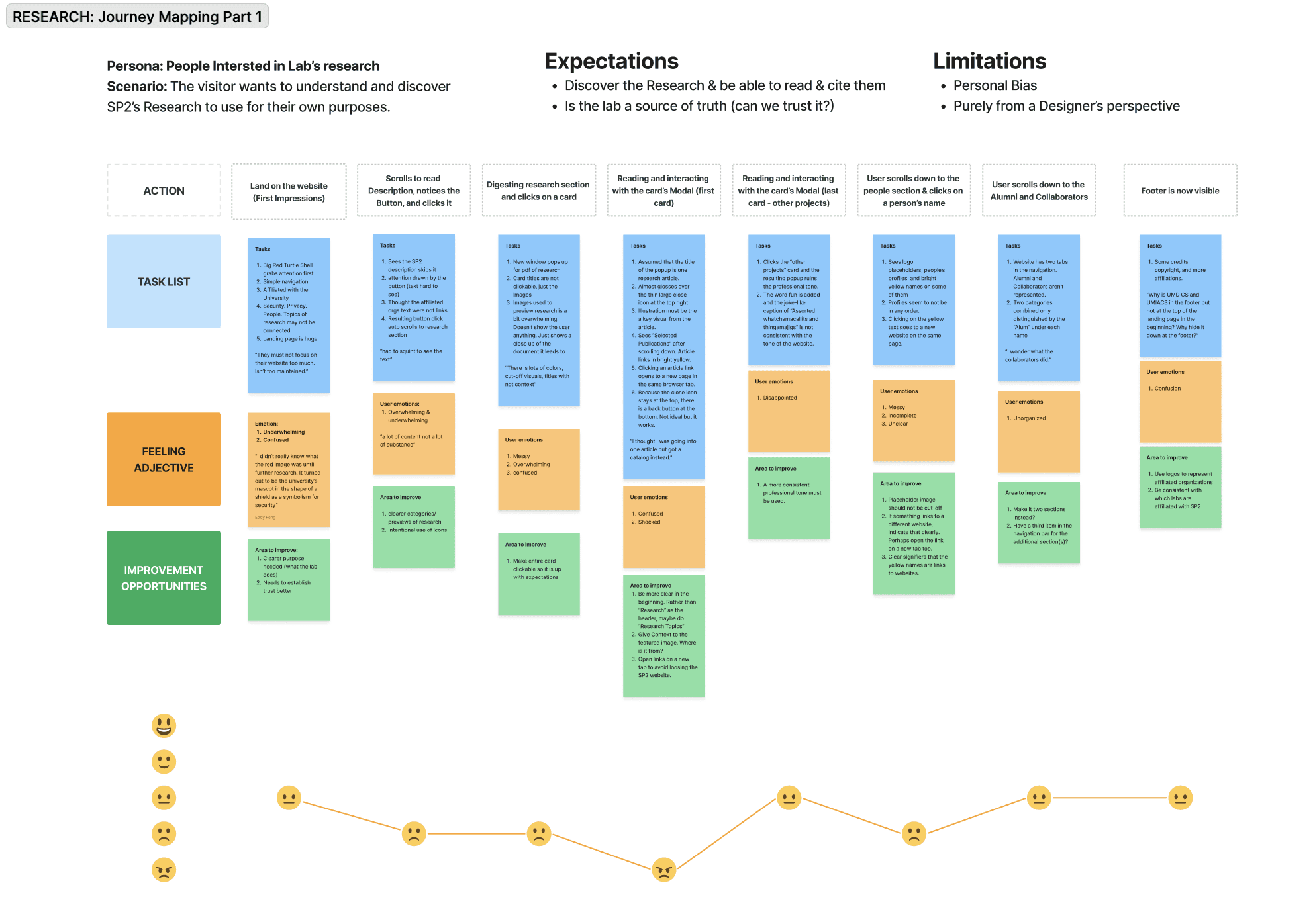
My user research revealed these constraints would create significant usability problems, setting up a classic tension between user needs and stakeholder preferences.
This previous original design below showcases the lab's signature yellow typography
Understanding the Constraints
Stakeholder Requirements:
Through initial meetings, I learned the team valued:
Simplicity above all - They saw their current single-page layout as elegant
Minimal visual elements - Believed academic sites should look "serious and plain"
Specific color preferences - Yellow was part of their visual identity vision
Resistance to major changes - Strong emotional attachment to existing structure
User Research Reality:
8 user interviews and competitive analysis revealed completely different needs:
Users were overwhelmed by dense, unorganized information
Navigation was critical for different user types (students vs. collaborators vs. participants)
Visual hierarchy was essential for scanning research content
Accessibility was being compromised by design choices
The central challenge: How do you improve user experience while respecting stakeholder constraints and emotional attachments to existing design?
Solving the Single-Page Constraint
The team insisted on a one-page design, but my user research showed people needed clear navigation paths for different goals. I had to get creative.
The Solution - Organized Single-Page Architecture:
Instead of fighting the constraint, I embraced it and created a highly structured single page:
Clear hero section - Immediately explains what the lab does
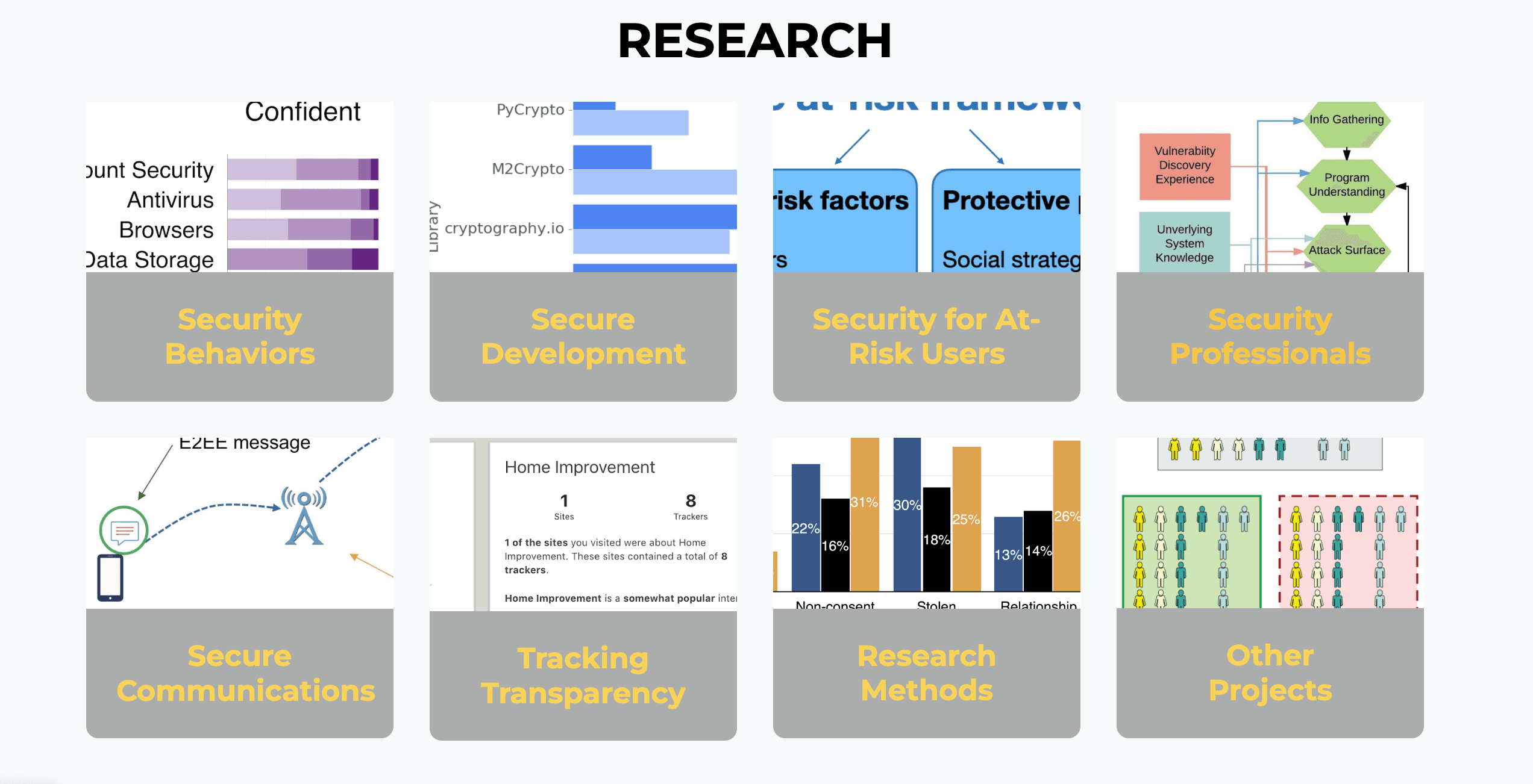
Visual research showcase - Organized cards that don't require separate pages
Sectioned information - People, publications, and opportunities clearly divided
Smart progressive disclosure - Expandable sections for detailed information
Sticky navigation - Jump-links to different sections of the single page
Strategic call-to-actions - Clear paths for different user types within the page flow
Design Solutions Within Constraints
Information Architecture on One Page:
Hero Section: Mission statement and key research areas in 15 seconds
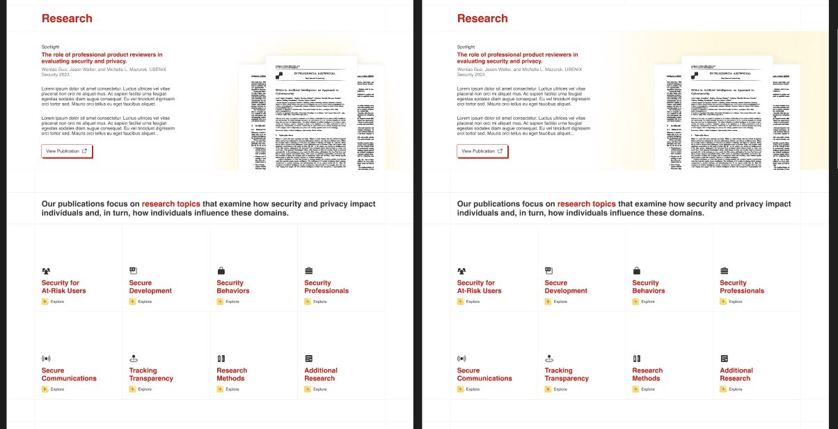
Research Highlights: Visual cards showing 3-4 key projects with expandable details
Team Section: Photo grid with role-based groupings and contact information
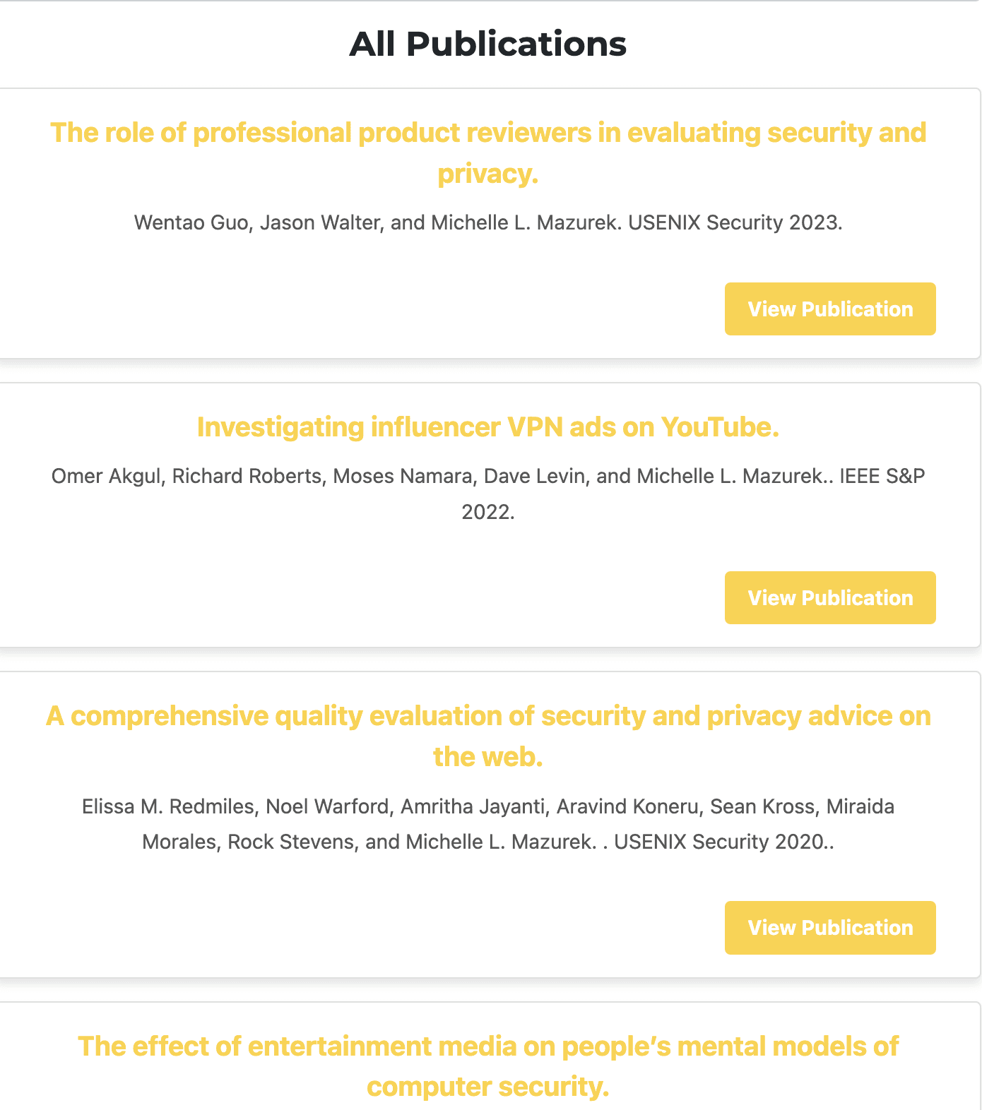
Publications: Recent highlights with link to external full repository
Visual Design Strategy:
Clean, academic aesthetic that satisfied stakeholder preference for "plain" design
Strategic use of whitespace to create hierarchy without complex visual elements
Typography-focused design using font weight and size for emphasis
Minimal color palette with yellow and red used sparingly for accent elements
Card-based layouts to organize information without seeming cluttered
Image below covers the rejected initial design proposal. The client expressed concerns that the visual approach appeared "too affiliated with the University of Maryland." Despite the design's improved usability and professional presentation.
User Testing Results:
Comparative testing: Current site vs. redesigned single page
6 participants, key tasks:
Understand what research the lab conducts
Find information about participating in studies
Locate recent publications and team expertise
Current site feedback:
"Confusing and hard to navigate"
"I couldn't figure out what they actually do"
"Felt overwhelming and academic"
Redesign feedback:
"Much clearer and more professional"
"Super refreshing, easy to find what we're looking for"
"That's amazing how you were able to make it look so much cleaner"
Key Insight: Users actually appreciated the single-page approach when it was well-organized, saying it felt "comprehensive but not overwhelming."
Stakeholder Management Outcomes
What Worked:
Collaborative problem-solving - Treating constraints as design challenges, not obstacles
Education through demonstration - Showing accessibility issues rather than just explaining them
Strategic compromises - Finding ways to incorporate stakeholder preferences without compromising usability
Incremental change - Building trust through small wins before proposing bigger changes